NJ Transit App
ROLE
Full-Stack Designer
TIMELINE
2024 (Sept - Oct)
SKILLS
Product Design
Interaction Design
Prototyping
Introduction
Research
The Solution
User Persona
Design
Prototype
Conclusion
Introduction
The NJ Transit app serves millions of commuters and travelers in New Jersey, offering essential services such as schedules, ticketing, and real-time updates for buses, trains, and light rail. Despite its importance, the app has faced criticism for its complex and frustrating user experience, leaving many users dissatisfied.
This project seeks to redesign the app with the goal of addressing its usability issues and providing a more seamless and intuitive experience for its diverse user base.
The Audience
Daily Commuters: Individuals who rely on NJ Transit for their daily commute to work or school.
Occasional Travelers: People using the app for one-off trips or leisure travel within New Jersey and neighboring areas.
Visitors: Tourists unfamiliar with the region who need reliable navigation and scheduling assistance.
The Problem
Currently, the NJ Transit app presents numerous pain points that hinder the user experience, including:
Poor Navigation
The current app's interface is cluttered and offers several different pathways to access the same function, making it confusing and difficult for users to quickly find the information they need, especially when on the go.
Missing Features & Key Gaps
The app does not allow users to easily view train schedules on alternate dates from the "Favorites" tab. For regular commuters, this is a key missing feature. Being able to toggle dates quickly from a saved route would improve efficiency for users who frequently travel on a regular schedule. As it stands, users must manually re-enter their destination and date, even if they've already saved the route.
Once a train departs, users can no longer easily track its status. Real-time updates about trains that have already left– such as delays or changes to their schedule– are hard to access. This is a significant shortcoming for for commuters who may be traveling to a station to meet a late train or pick up a friend.
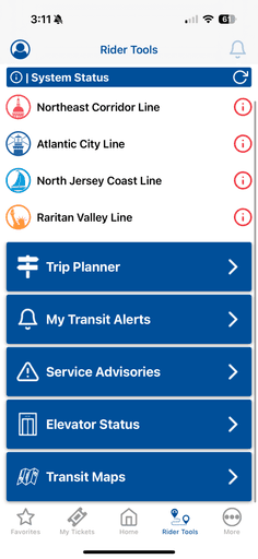
Features that are Not Self-Explanatory
The "Rider Tools" section, housed in the Miscellaneous tab, contains a variety of features that aren't immediately clear to users. For example, tools like "Station Information" or "Service Updates" are buried deep in the menu and often lack sufficient context or descriptions. New or occasional users may not even realize these features exist, and even regular users often fail to understand the full potential of these tools. The ambiguous labeling and hidden placement contribute to a lack of discoverability and utilization of potentially helpful features.
Design Issues
The app’s visual design is heavy-handed and feels dated, with sharp edges, rigid boxes, and high contrast colors that make it uncomfortable to use for extended periods. The design lacks fluidity, with static elements that don’t feel cohesive or easy on the eyes.
Many screens overwhelm users with text, making it difficult to quickly scan and digest essential information. Tiny font sizes and poorly spaced elements reduce legibility, especially in areas with complex data, like the schedule view or ticket purchasing screens.
The Solution
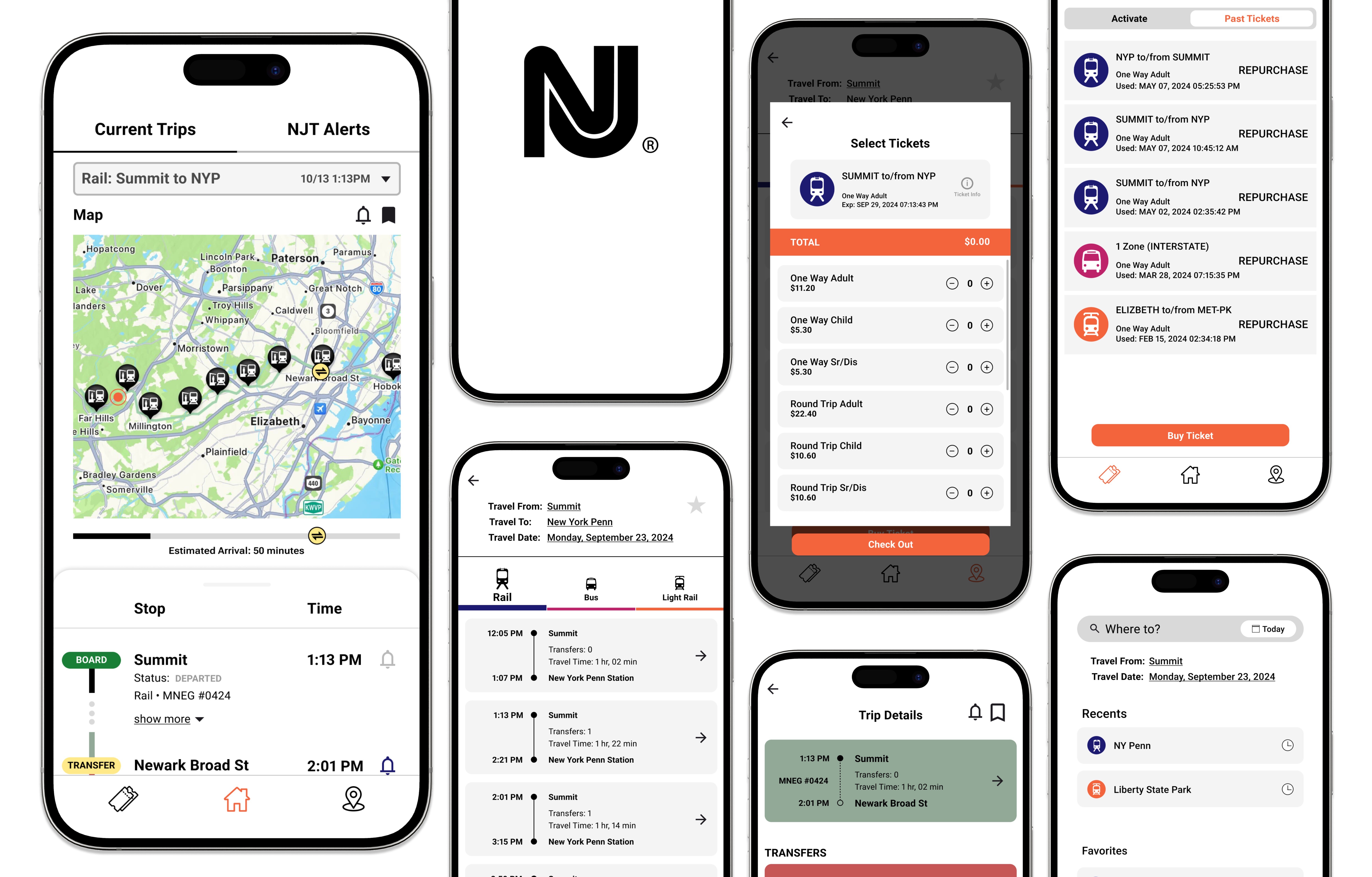
A redesign of the NJ Transit app focused on getting people to where they need to be FAST.
I revamped the NJ Transit app to remedy the confusing and inconvenience of the original version, with the goal of creating a clean and minimalistic interface to help commuters easily navigate through the application find the information they need to reach their destinations seamlessly.
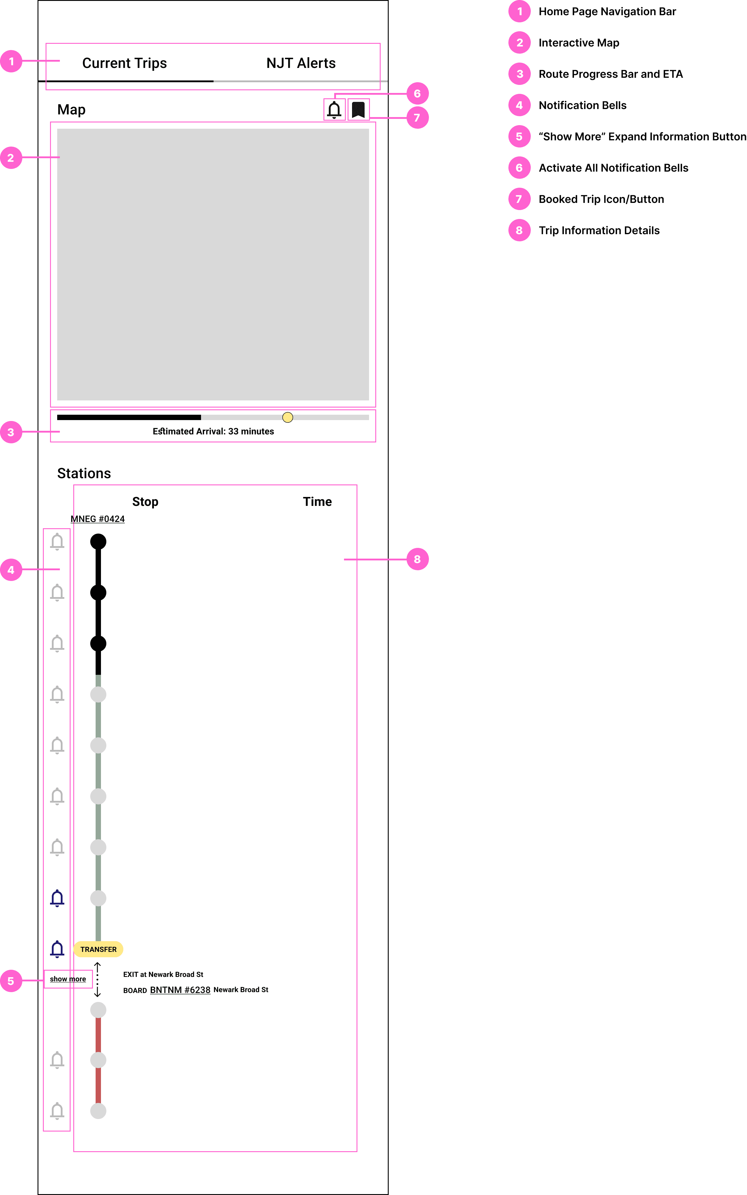
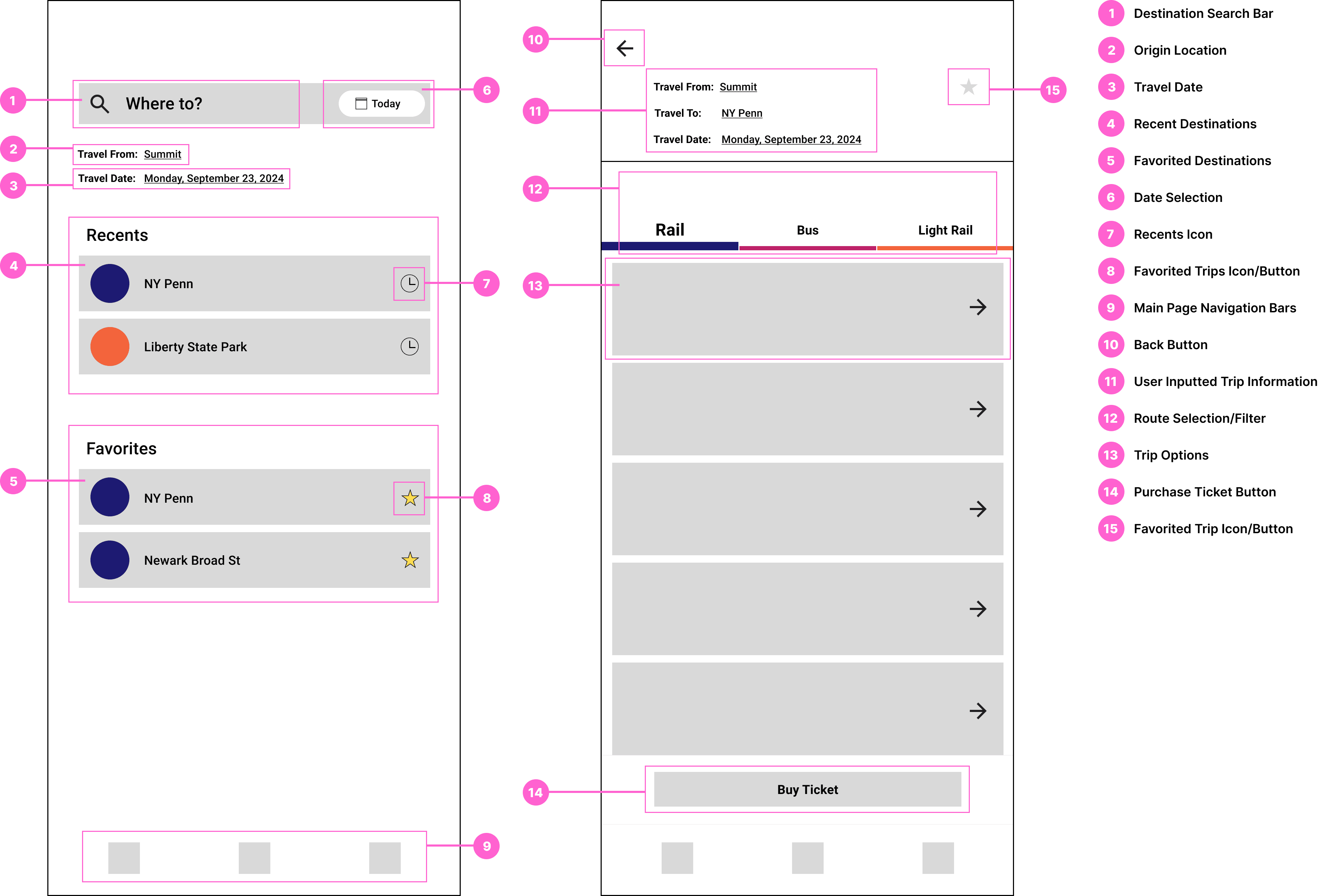
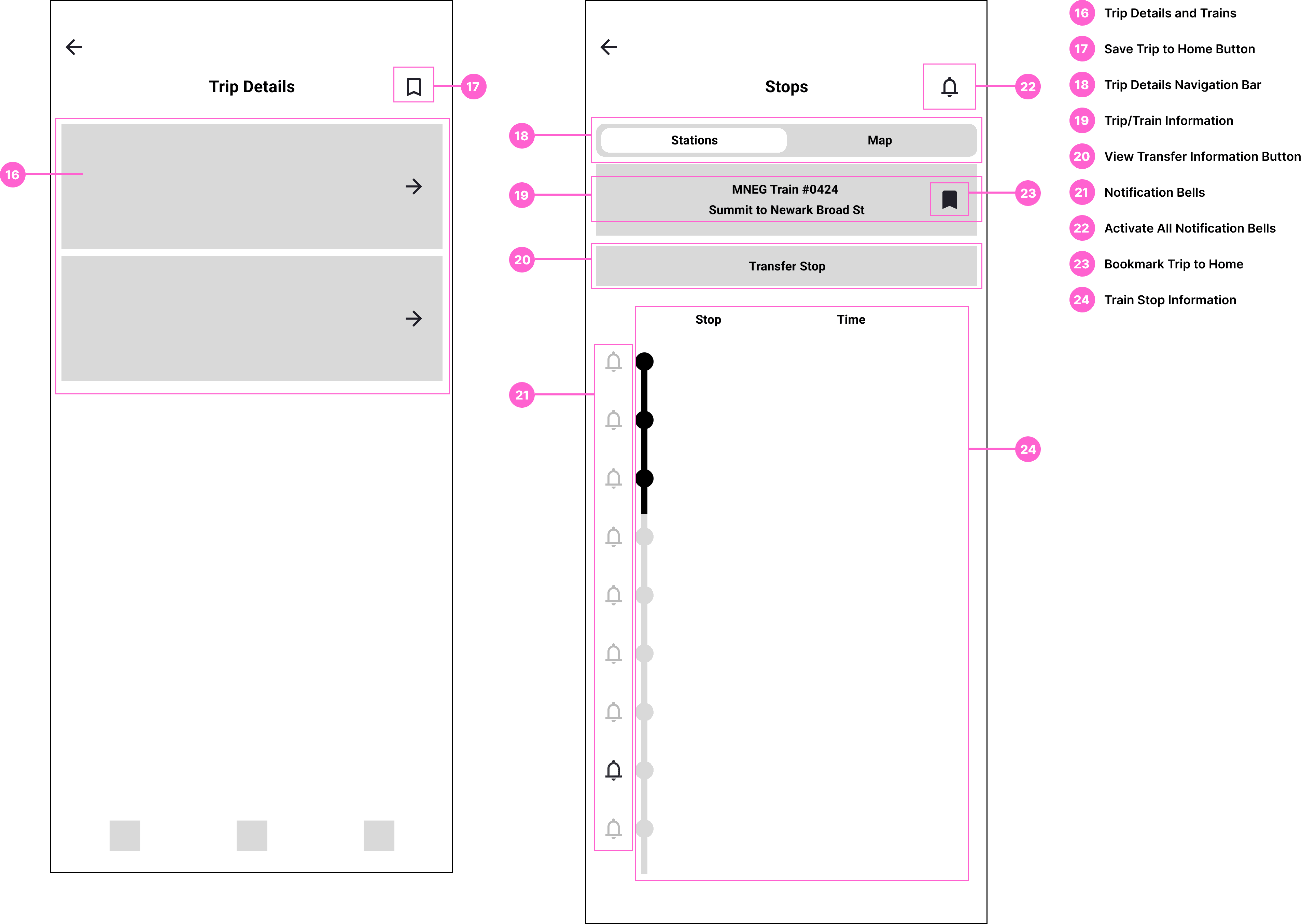
Streamlined Homepage for Quick Access to Real-Time Information
This homepage focuses on the user's most immediate need: staying updated on their current trip.
Friendly Interface for Selecting Trip Destinations and Finding Routes
The app's redesigned trip search and planning process will prioritize speed and ease.
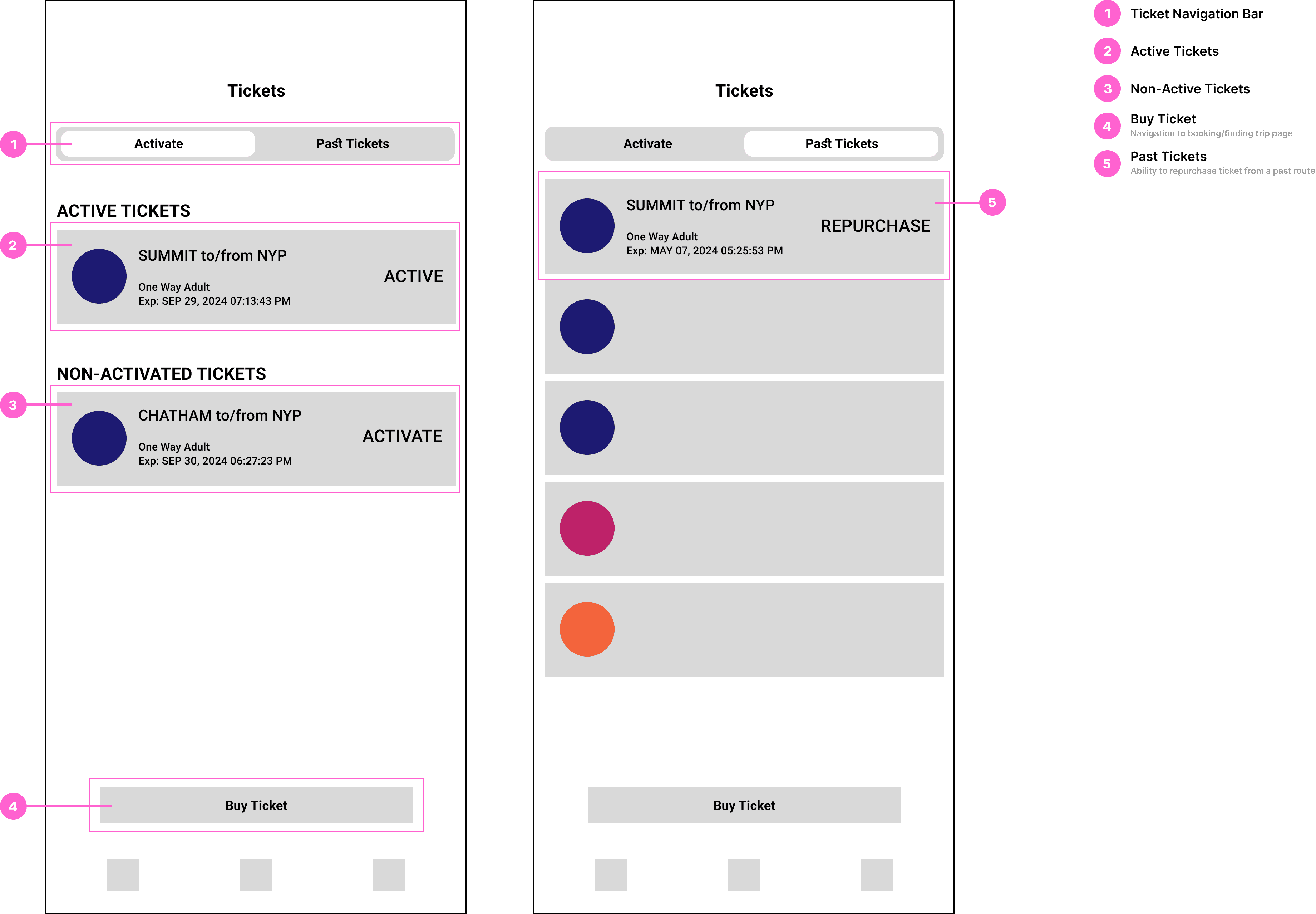
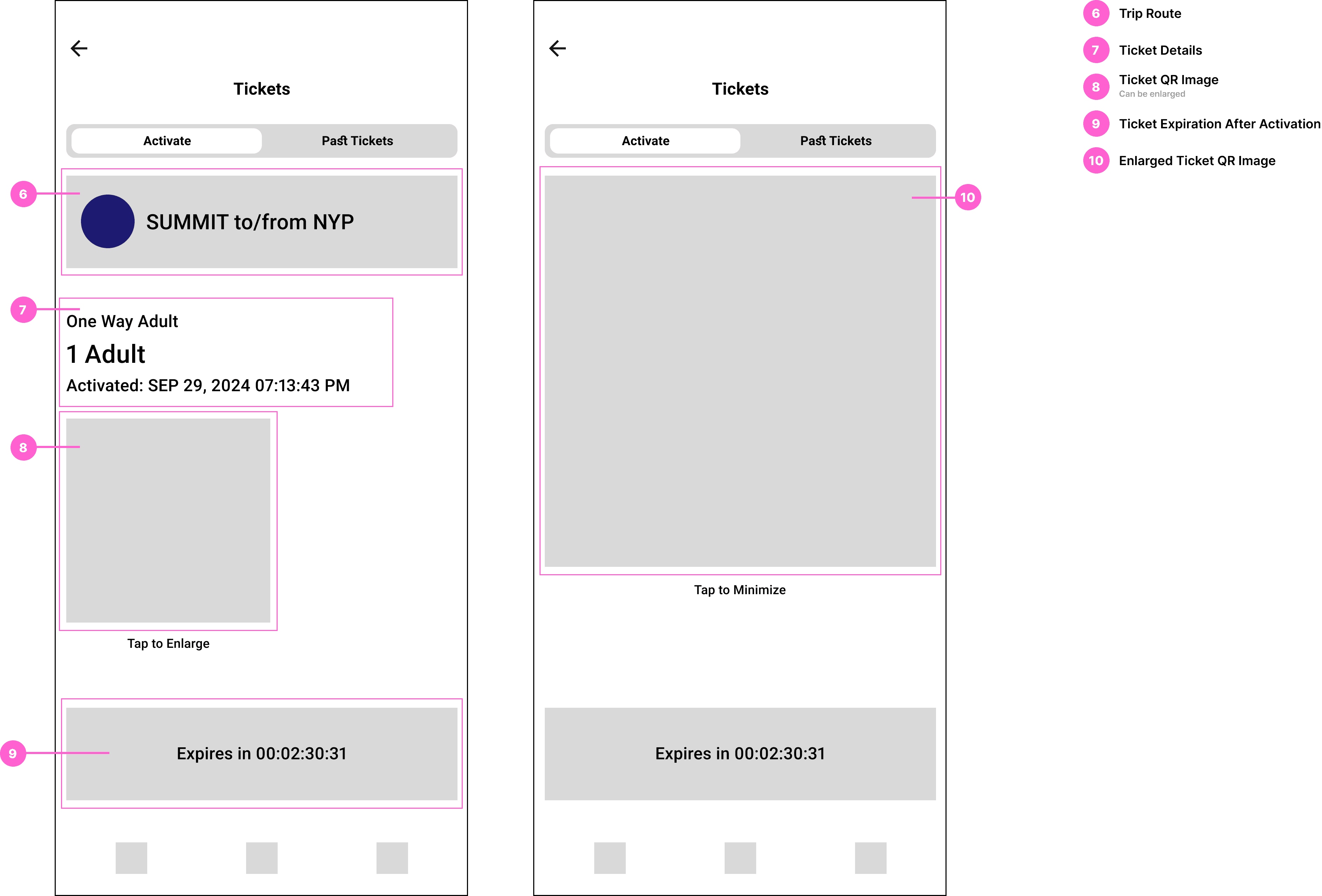
Simplified Ticket Navigation Page
The redesigned Tickets Page streamlines ticket access and travel management, prioritizing speed and ease of use. A new feature enabling users to repurchase tickets simplifies the process of rebooking previously taken trips.
Research
Understanding the problem by analyzing user behavior and identifying pain points.
Observing My Own Usage
I personally use the NJ Transit app, and in my period of research, I paid close attention to the challenges I faced while navigating the app. I documented instances where I experienced confusion, delays, or frustration. This first-hand experience helped me pinpoint key pain points and areas where the app's design was either redundant or unnecessarily complex. I made notes on:
• Navigation issues: Where did I get stuck or spend too much time? Finding where to begin looking for trip routes from the home screen.
• Cluttered interfaces: I observed instances where the screen was overcrowded with too much information or too many options.
• Missed functionalities: I took note of features I expected to find but couldn't easily access, such as real-time alerts for delays or saved trips, as well as tracking current trip status after train departure and estimated time of arrival.
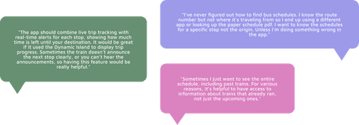
Gathering Feedback from Other Users
In addition to observing my own usage, I also gathered qualitative feedback from friends and family members who regularly use the NJ Transit app as well as those who have never used the app. I asked them to complete specific tasks (e.g., finding a train schedule, purchasing a ticket, or checking real-time service updates) while I observed and took notes. Their feedback also provided insights into areas that I may have overlooked.
Takeaways:
• Frustrations with navigation: Many users expressed confusion over the app's multiple pathways to the same function. For example, some didn't understand the difference between the "Schedule" tab and the "Trip Planner" feature, leading to confusion about where to find accurate trip information. First time users, in particular, struggled to find key features, with some unsure of where to even start looking for basic functions that should have been more intuitive.
• Inefficient ticket purchasing: Several users mentioned how difficult it was to purchase tickets, with a multi-step process that felt tedious and unclear. For instance, the app requires users to know exactly which stations they are traveling between in order to purchase the correct ticket. This presents a challenge for new riders or infrequent users who may not know the full range of stations or even the most direct routes.
Other points mentioned:
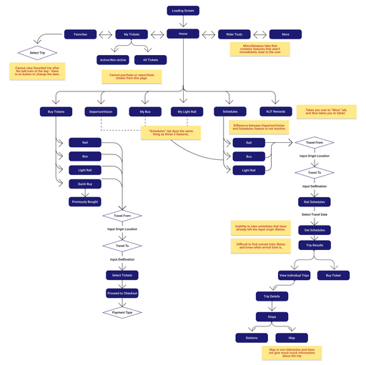
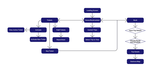
Creating a UI Flow of the Current App
To understand how users normally interact with the app, I created a UI flow diagram of the current version of the NJ Transit app. This exercise allowed me to visually map out the user's journey through the app, highlighting the steps required to complete common tasks such as:
• Finding train schedules
• Purchasing tickets
• Accessing saved routes
• Checking real-time alerts or delays
By analyzing the UI flow, I could see where users were likely to encounter bottlenecks or confusing elements. For instance, I noted:
• Excessive clicks: Many common tasks, like checking schedules or purchasing tickets, required navigating through several menus and submenus, increasing the time it took to complete a single task.
• Redundant features: I found multiple flows leading to the same function (e.g., multiple ways to purchase a ticket), which unnecessarily complicated the app and increased the cognitive load on users.
• Cluttered screens: Key screens were overwhelmed with too many options or text-heavy sections, making it difficult to find essential information quickly.
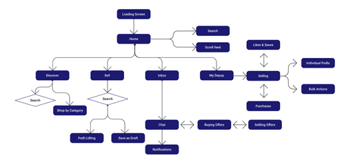
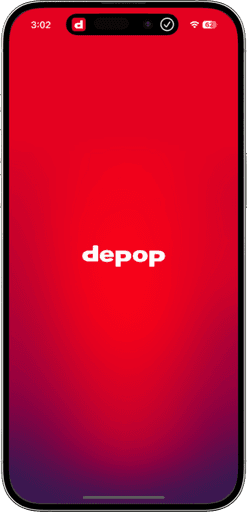
Comparative Study: NJ Transit v. Depop
To further inform my redesign, I compared the NJ Transit app to another app known for its excellent user experience– Depop, a popular social shopping platform. Depop is a well-designed app that excels in delivering a clean, intuitive interface and efficient user flow. I focused on several key aspects of Depop's design to contributed to its success:
• Minimalist design: Depop uses a simple, visually appealing interface that avoids clutter, with clear calls to action and intuitive navigation. The app's layout is easy to scan and doesn't overwhelm users with too many options at once.
• Streamlined task completion: In Depop, users can complete key tasks (e.g., browsing, purchasing, and payment) with minimal effort and steps. The design is optimized for speed, ensuring that the process is quick and easy without unnecessary delays or confusion.
• Clear hierarchy and prioritization: Depop's user flow emphasizes the most important features, ensuring that the users can find what they need right away. Unnecessary steps or distractions are removed, and the app guides users through each stage of their journey intuitively.
I used these insights to contrast with the NJ Transit app, identifying specific weaknesses:
• The NJ Transit app, like Depop, needs more streamlined approach to task completion, with fewer clicks required to perform core actions.
• The current NJ Transit app feels cluttered and overloaded with features, many of which are underused or not easy to find. A more minimalist approach would improve both usability and visual appeal.
From this,…
I was able to identify the key weaknesses of the NJ Transit app. This research informed my redesign process, ensuring that the new app would focus on simplicity, speed, and efficiency—helping users get where they need to go quickly and easily with the fewest clicks possible.
Design Process
I designed the main flow with first-time users in mind, introducing them to the key features while having it feel simple and manageable. Adhering closely to a set of product requirements and constraints helped me set a focused approach:
The app is…
• For first-time, occasional, and frequent commuters of the NJ Transit to quickly find information they need and get to where they need to be FAST.
• Redesigned to address and spotlight the most commonly used features of the NJ Transit app and missing needs of their commuters.
New UI Flow
UI Spec
Home Page
Book Trip Pages
Ticketing Pages
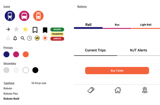
Creating the Brand:
VD Spec
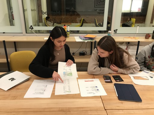
Test User 1
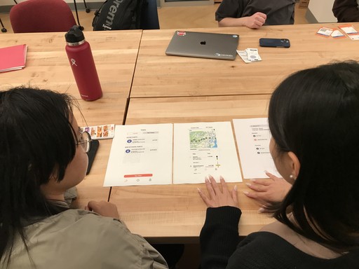
Test User 2
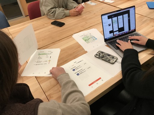
Test User 3
The Final Prototype
Task: You plan to leave my house at 1:00 PM. Find the next train schedule from Summit, New Jersey to NY Penn Station.
Hint: remember to save the trip in order to view it on the homepage.
Conclusion
Since this was a part of a class project, we were only required to redesign part of an existing application product to make it better. If given more time or if I'd like to revisit this project in the future, I would create a more extensive prototype that is fully functional as well as add more tools and features that could be useful to a user, such as a trip planning feature.
What I learned
1. Peer feedback saved my project
I asked fellow classmates to test my UI prototype and they challenged all of my design decisions, making sure there was valid support behind everything.
2. Use existing interfaces to inspire new ways of designing
Throughout this project, I learned the value of drawing inspiration from existing applications and UI design solutions. By analyzing designs from apps within the same category and those from entirely different domains, I discovered how diverse perspectives can spark innovative solutions. This approach not only expanded my understanding of industry standards but also encouraged me to think creatively about solving problems in unique and impactful ways.
Designed with detail and care by Iris.