NJ Transit
A Redesign of the NJ Transit App
7 Minute Read
ROLE
UX Researcher
Product Designer
TIMELINE
2024 (Sept - Oct)
Introduction
Solution
Research
Design Process
Prototype
Conclusion
Introduction
The NJ Transit app serves millions of commuters and travelers in New Jersey, offering essential services such as schedules, ticketing, and real-time updates for bus, rail, and light rail. Despite its importance, the app has faced criticism for its complex and frustrating user experience, leaving many users dissatisfied.
My goal is to redesign the app with the intention of addressing usability issues and providing a seamless, intuitive experience for its diverse user base.
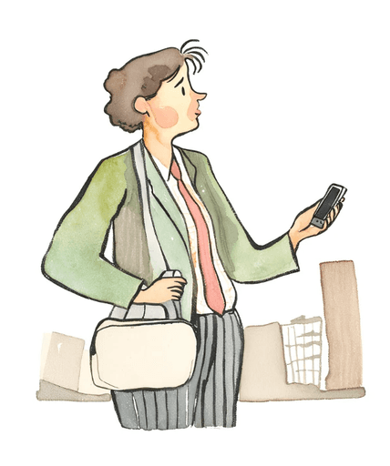
The Audience
Daily Commuters: Individuals who rely on NJ Transit for their daily commute to work or school.
Occasional Travelers: People using the app for one-off trips or leisure travel within New Jersey and neighboring areas.
Visitors: Tourists unfamiliar with the region who need reliable navigation and scheduling assistance.
The Problem.ᐟ
Currently, the NJ Transit app presents numerous pain points that hinder the user experience. These include…
01 Poor Navigation
The user interface is congested and presents several channels to reach the same feature, causing perplexity and ineffectiveness, particularly for first time users.
02 Missing Features & Gaps
Ticket Repurchase: Users cannot easily access frequently purchased tickets without re-entering destinations and dates manually.
Real-Time Tracking: Once a train departs, train status and real-time updates about delays or schedule changes are difficult to access, leaving commuters unprepared for changes.
03 Design Flaws
Visual Design: The app’s outdated aesthetic—rigid boxes, sharp edges, and high-contrast colors—feels clunky, is hard on the eyes, and uncomfortable for extended use.
Text Overload: Screens are overcrowded with text, featuring tiny fonts and poor spacing, which reduce readability and make essential information harder to scan.
How might we transform the NJ Transit app into a trusted, intuitive companion for stress-free commuting?
The Solution
The redesigned NJ Transit app prioritizes speed, simplicity, and efficiency to help users get where they need to be—fast.
Streamlined Navigation: A clean and minimalistic interface ensures commuters can easily find the information they need without confusion.
Enhanced Usability: The revamped design eliminates unnecessary complexity, allowing users to seamlessly navigate the app and manage their travel with ease.
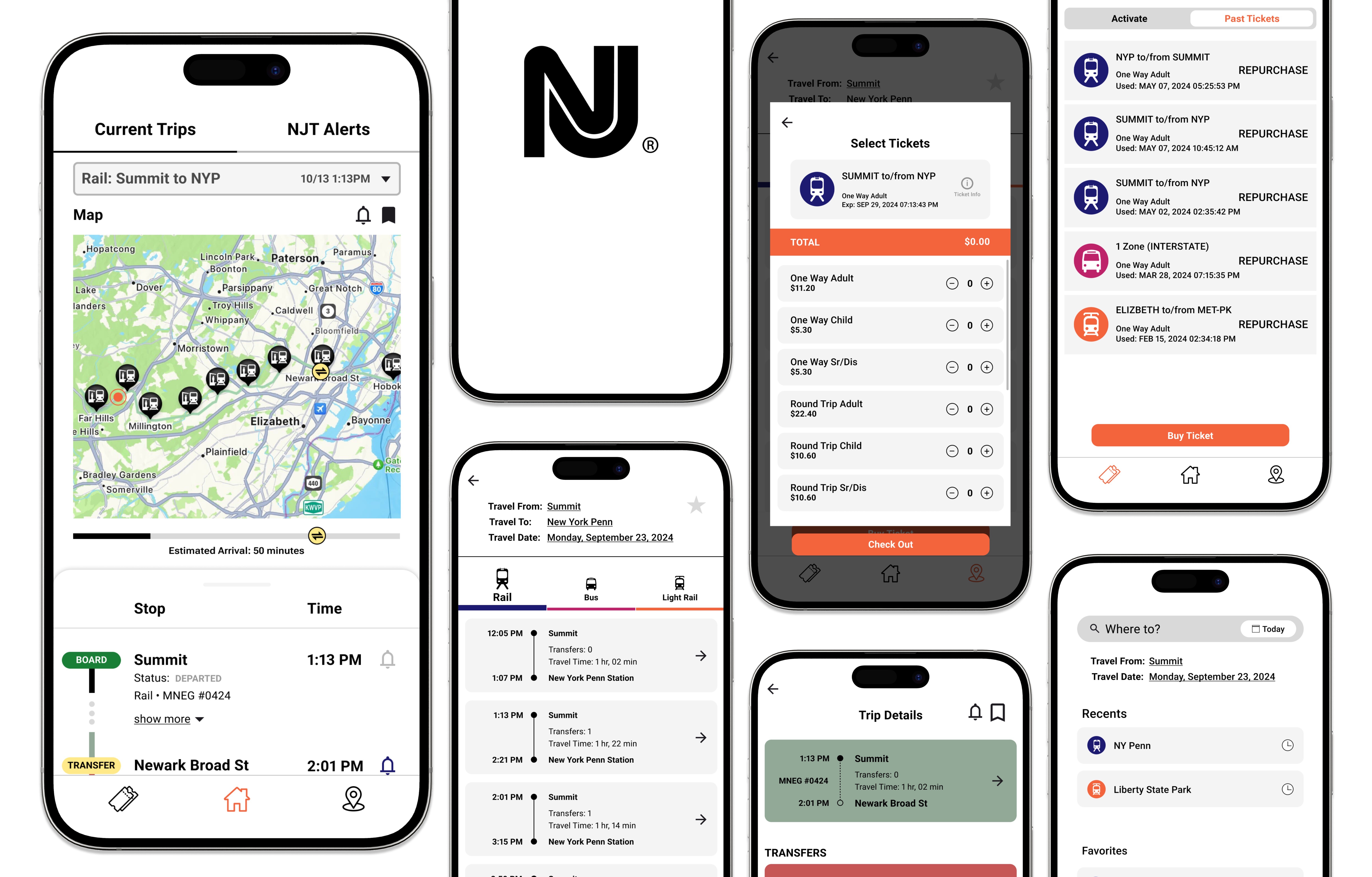
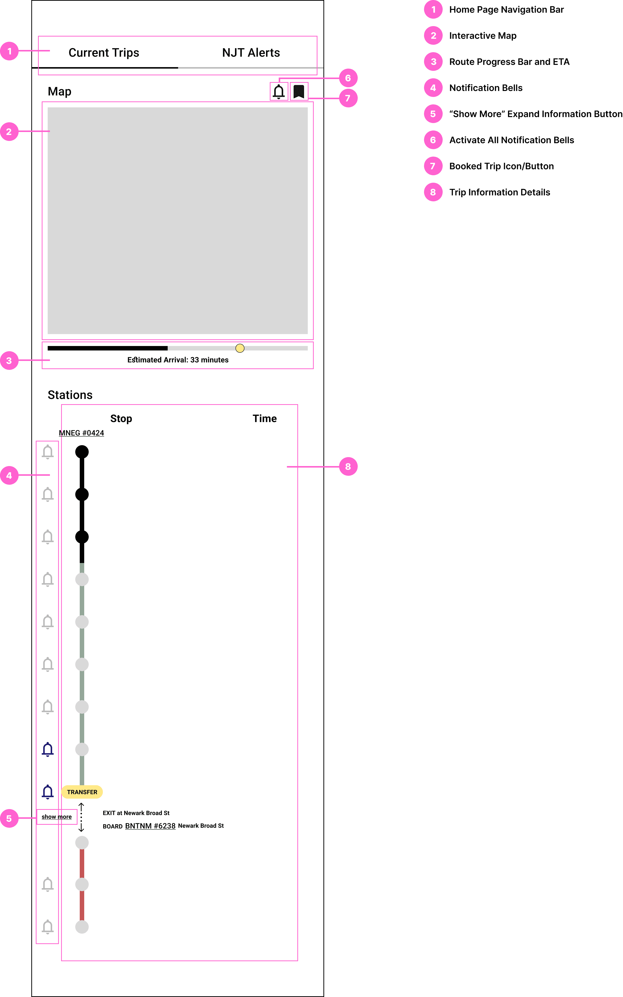
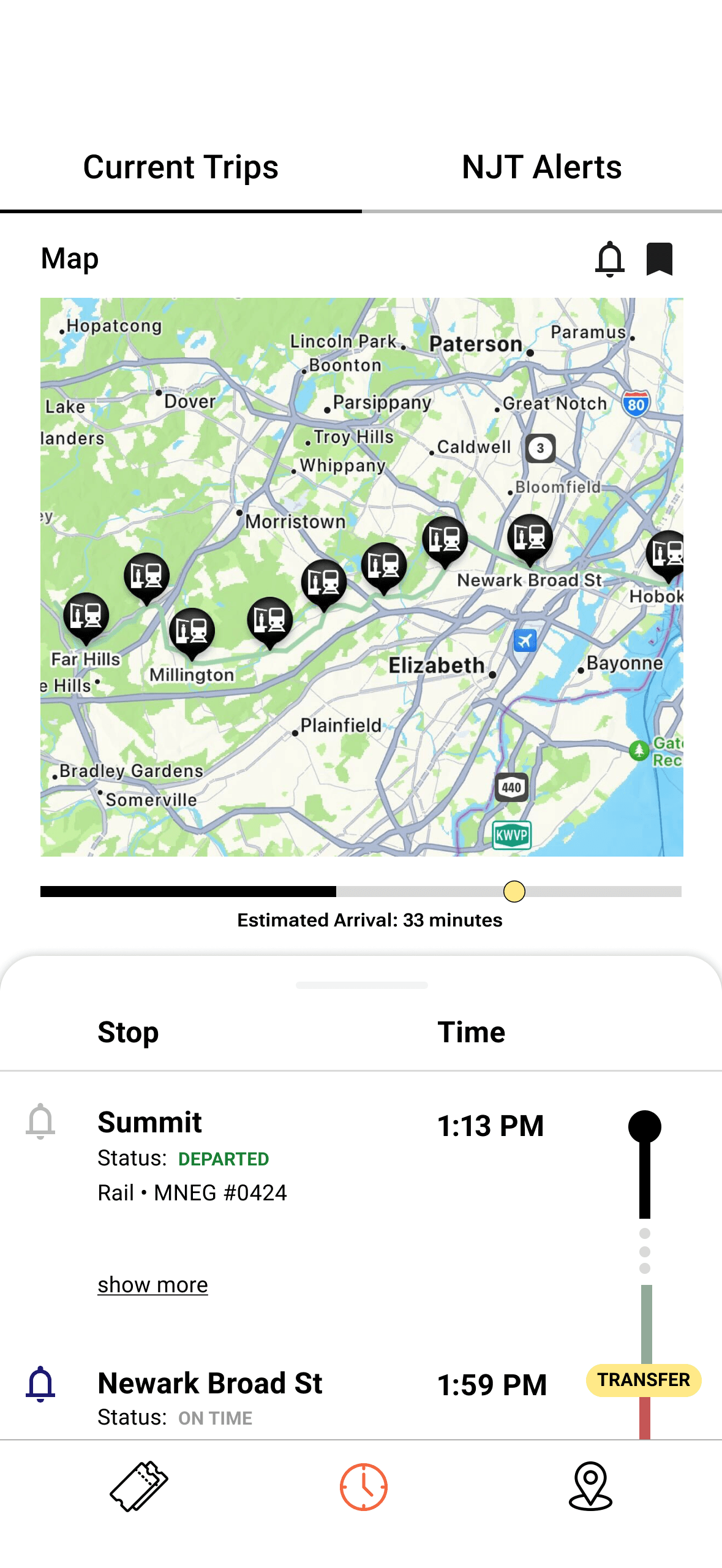
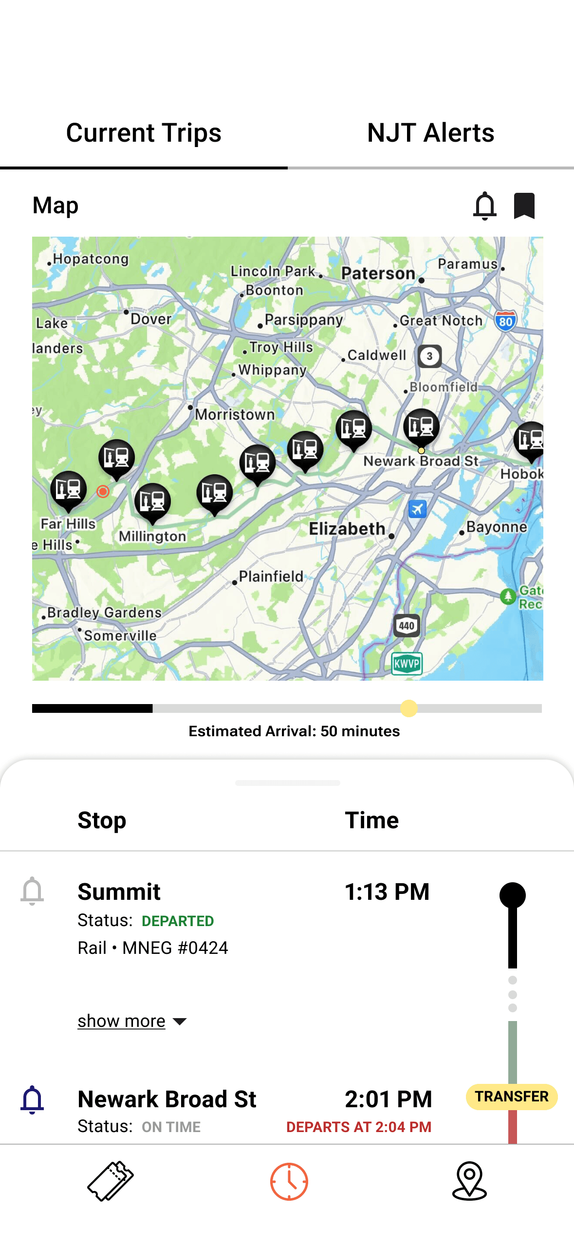
01 Streamlined Homepage for Quick Access to Real-Time Information
This homepage focuses on the user's most immediate need: staying updated on their current trip.
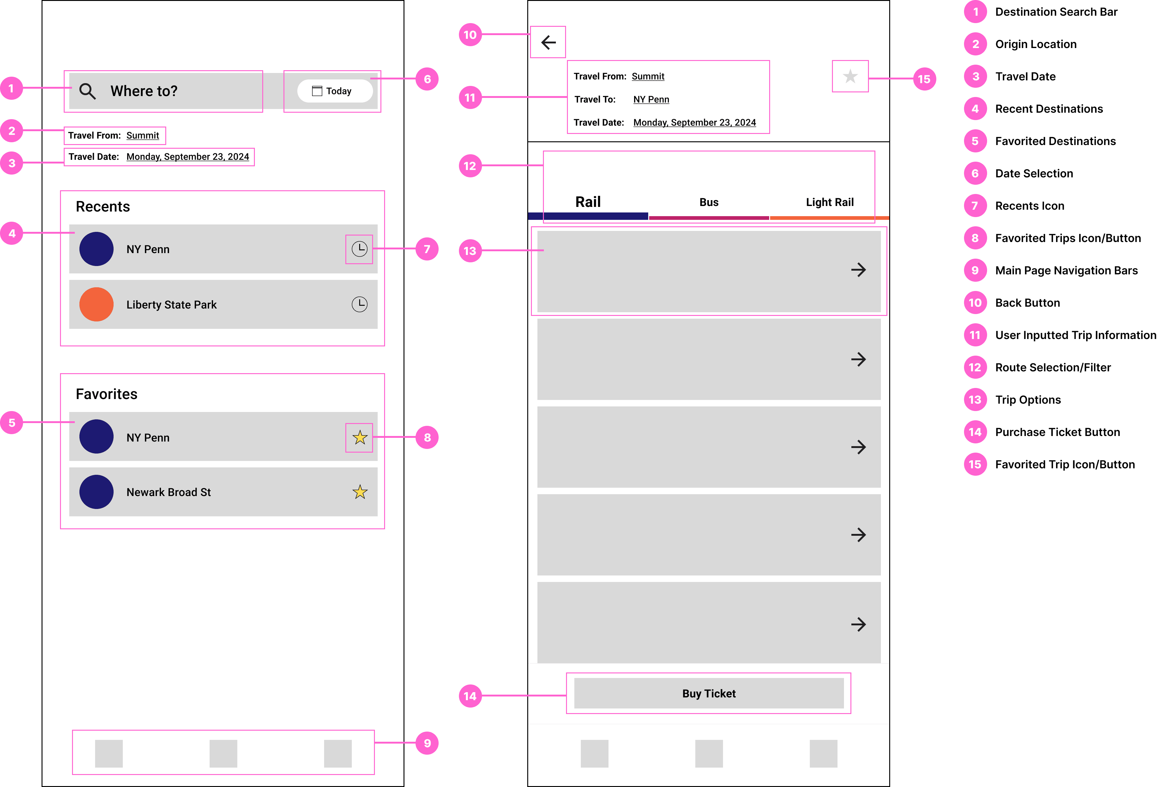
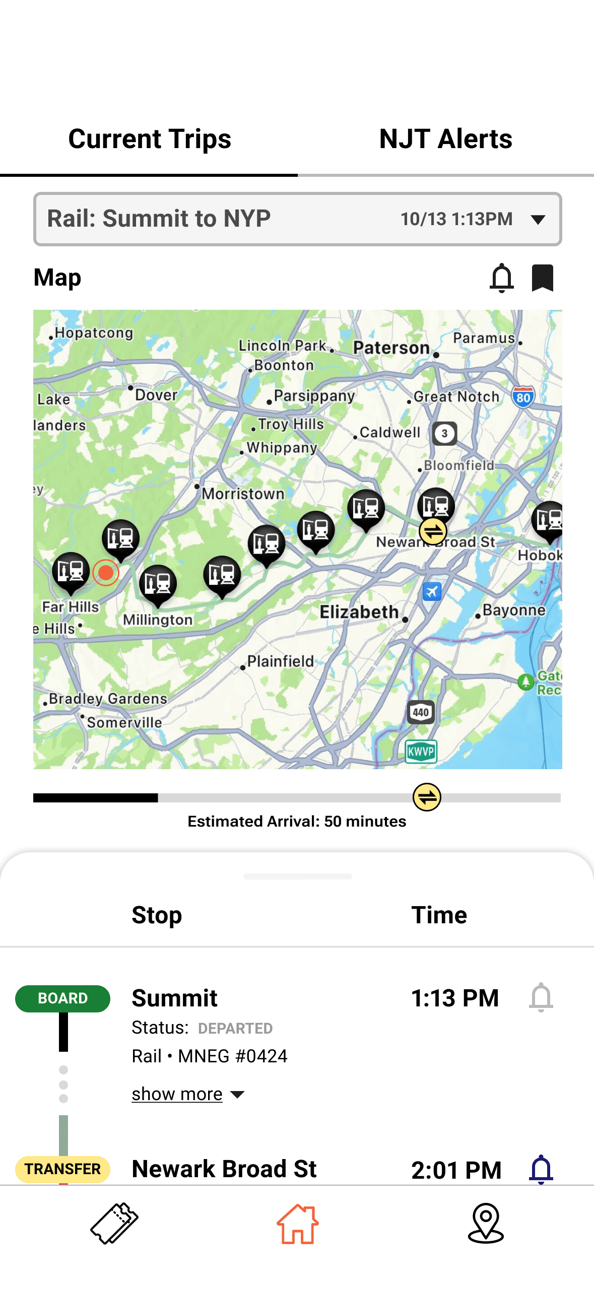
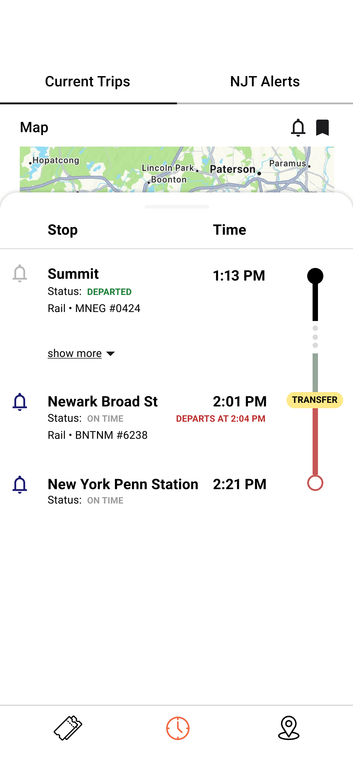
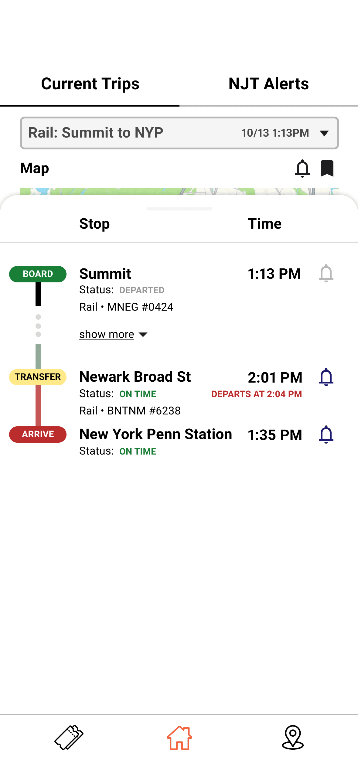
02 Friendly Interface for Selecting Trip Destinations and Finding Routes
The app's redesigned trip search and planning process will prioritize speed and ease.
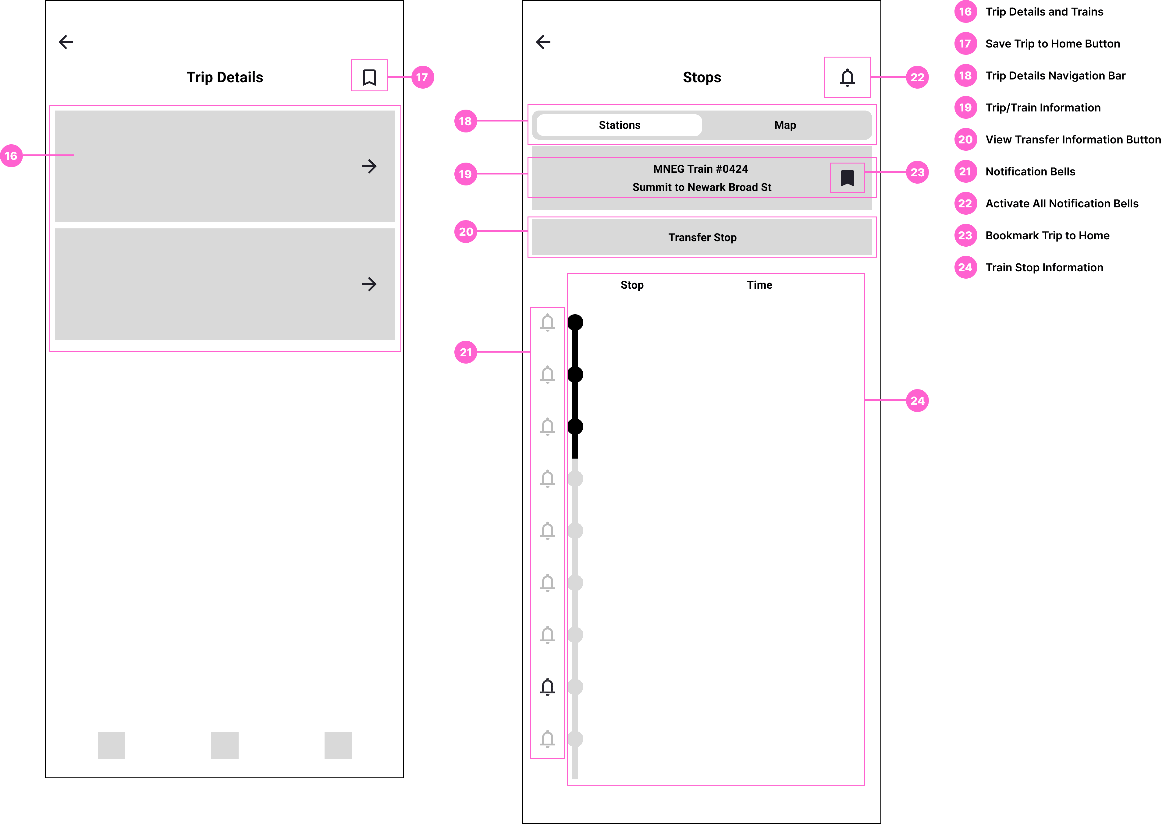
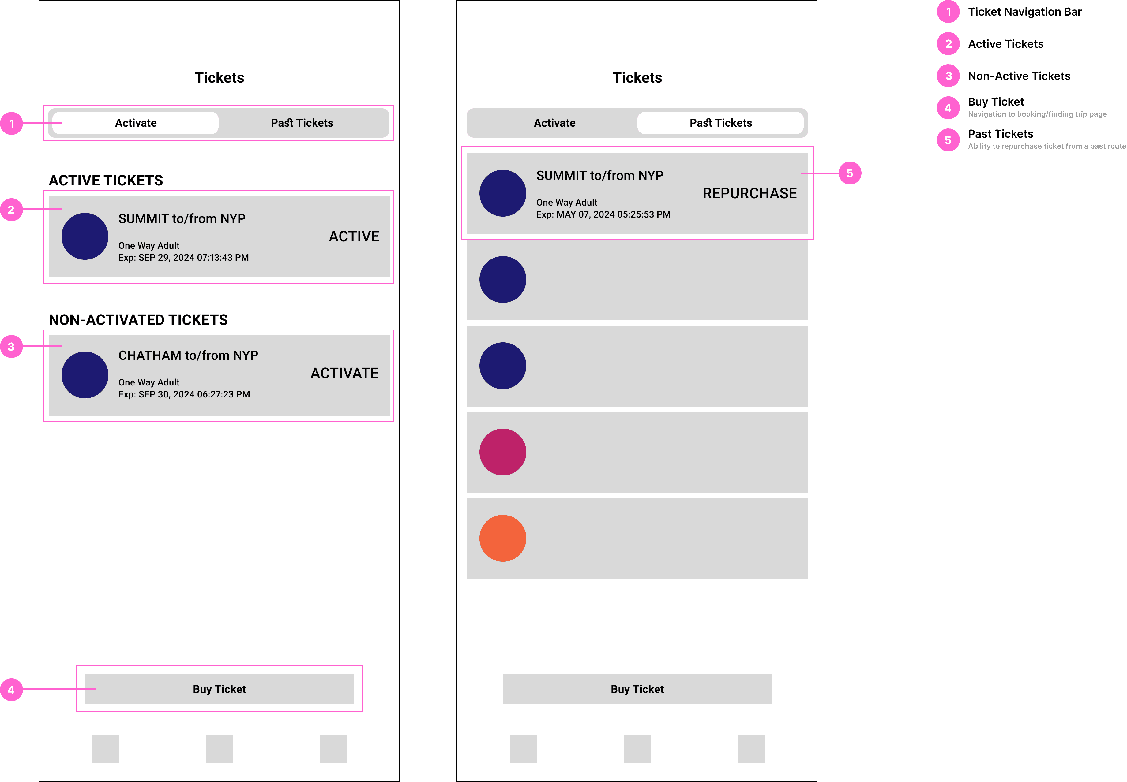
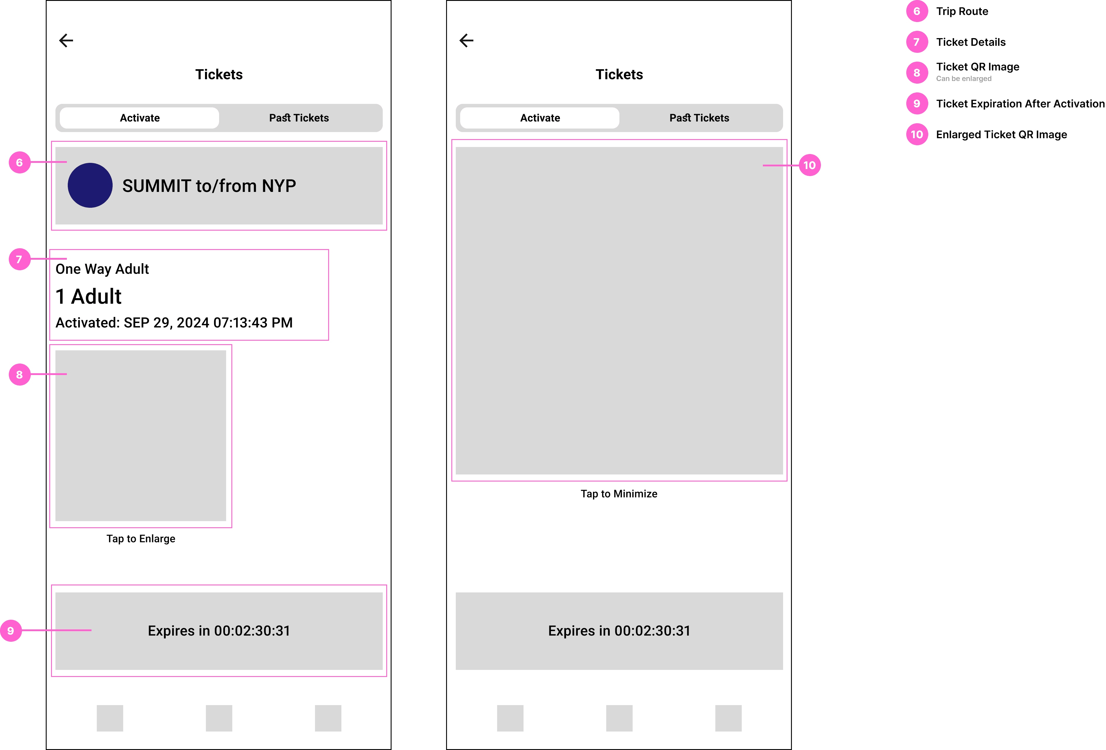
03 Simplified Ticket Navigation Page
The redesigned Tickets Page streamlines ticket access and travel management, prioritizing speed and ease of use. A new feature enabling users to repurchase tickets simplifies the process of rebooking previously taken trips.
Research
I conducted user research to better understand the problem. By analyzing user behavior and gathering feedback, I identified key pain points in the current NJ Transit app experience.
01 Observation Study
As a regular NJ Transit app user, I documented challenges I encountered during daily use—focusing on areas of confusion, delays, and friction. Key observations included:
Navigation Issues: Difficulty identifying where to begin searching for trip routes from the home screen.
Cluttered Interfaces: Screens overcrowded with information or too many options, slowing down decision-making.
Missed Functionalities: Lack of easy access to features like real-time alerts for delays, saved trips, and tracking train status after departure.
02 User Testing & Feedback
I conducted usability tests with friends and family, both regular users and newcomers, I asked them to complete tasks such as buying tickets or checking train status. Their feedback highlighted:
Frustrations with Navigation: Confusion over redundant features like "Schedule" vs. "Trip Planner," and difficulty locating essential functions, especially for first-time users.
Inefficient Ticket Purchasing: The multi-step process was unclear and tedious, particularly for new riders unfamiliar with station names or direct routes.
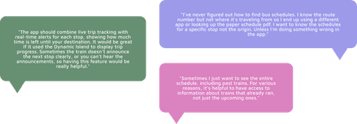
03 Community Insights
I reviewed public forums and online communities (e.g., Reddit, app store reviews) to gather unfiltered user sentiment and identify recurring frustrations. Examples included:
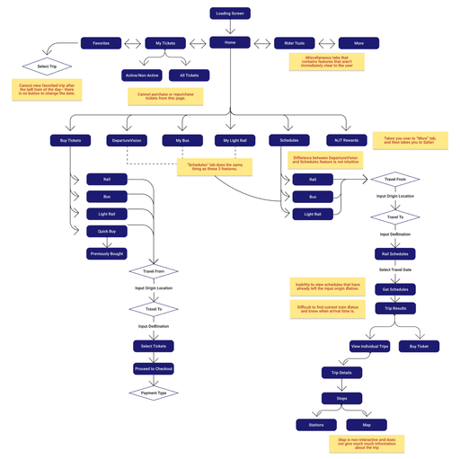
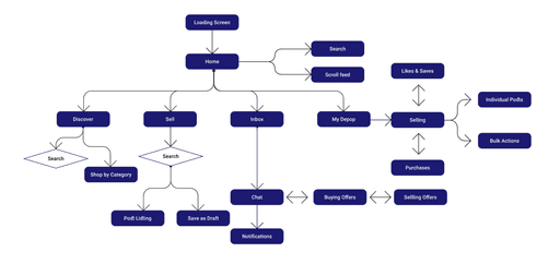
04 UI Flow Analysis
To better understand how users interact with the NJ Transit app, I mapped out the app's current user flows.
Key Findings
Excessive Clicks: Simple tasks like checking schedules or purchasing tickets required navigating through multiple menus and submenus, leading to inefficiency.
Redundant Features: Multiple pathways to the same function (e.g., purchasing tickets) added unnecessary complexity and increased users' cognitive load.
This analysis highlighted critical areas where the app's design could be streamlined to improve efficiency and usability.
05 Comparative App Study: NJ Transit v. Depop
To guide the redesign, I conducted a comparative analysis between the NJ Transit app and Depop– a social shopping platform recognized for its clean interface and seamless UX.
Key Takeaways from Depop
Minimalist Design: Clean visuals and intuitive navigation minimized clutter and enhanced usability
Streamlined Actions: Core tasks like browsing and purchasing were completed in just a few steps
Clear Hierarchy: Prioritized key features and guided users with intuitive flows
Implications for NJ Transit
Reduce the number of steps required for essential actions like finding schedules or purchasing tickets
Apply minimalist principles to declutter screens and improve focus
Highlight and prioritize the most critical features to support fast, stress-free commuting
Design Process
I approached the redesign with first-time users at the forefront, aiming to create a simple, approachable flow that introduces key features without overwhelming the user. Guided by a clear set of product requirements and constraints, I maintained a focused, user-centered strategy.
The Redesigned App is…
Built for all riders—first-time, occasional, and frequent NJ Transit commuters—helping them quickly access the information they need and reach their destination efficiently.
Refocused around real needs, prioritizing the most-used features and addressing common gaps identified through research, such as intuitive trip planning and real-time updates.
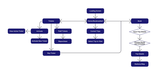
New User Flow
UI Specifications
Home Page ↓
Trip Booking Pages ↓
Ticketing Pages ↓
VD Specifications
Usability Tests and Iterations
I conducted 5 usability tests throughout the design process, including a frequent NJ Transit user. I wanted to test the clarity, completion, and comprehension of the features.
01 Homepage
Iteration 1 - Basic Layout
Initial visual design based on wireframes.
Established core layout but lacked interactive map functionality.
Iteration 2 - Functional Map & Time Visibility
Added real-time map interactivity showing current location, transfer, and destination stops.
Included train departure times at transfer stations for better trip planning.
Iteration 3 - UI Enhancements & Usability Fixes
Made transfer stop icons more prominent based on testing feedback.
Replaced time icon with more intuitive home icon in the nav bar.
Added a drop down to manage multiple saved trips more easily.
Relocated notification icons for better thumb access.
Updated trip progress bar with color-coded markers for boarding/arrival.
Adjusted train status colors (e.g. "on time" in green, "departed" in gray) to emphasize what matters most to users.
Iteration 1
Iteration 2
Iteration 3
Iteration 2
Iteration 3
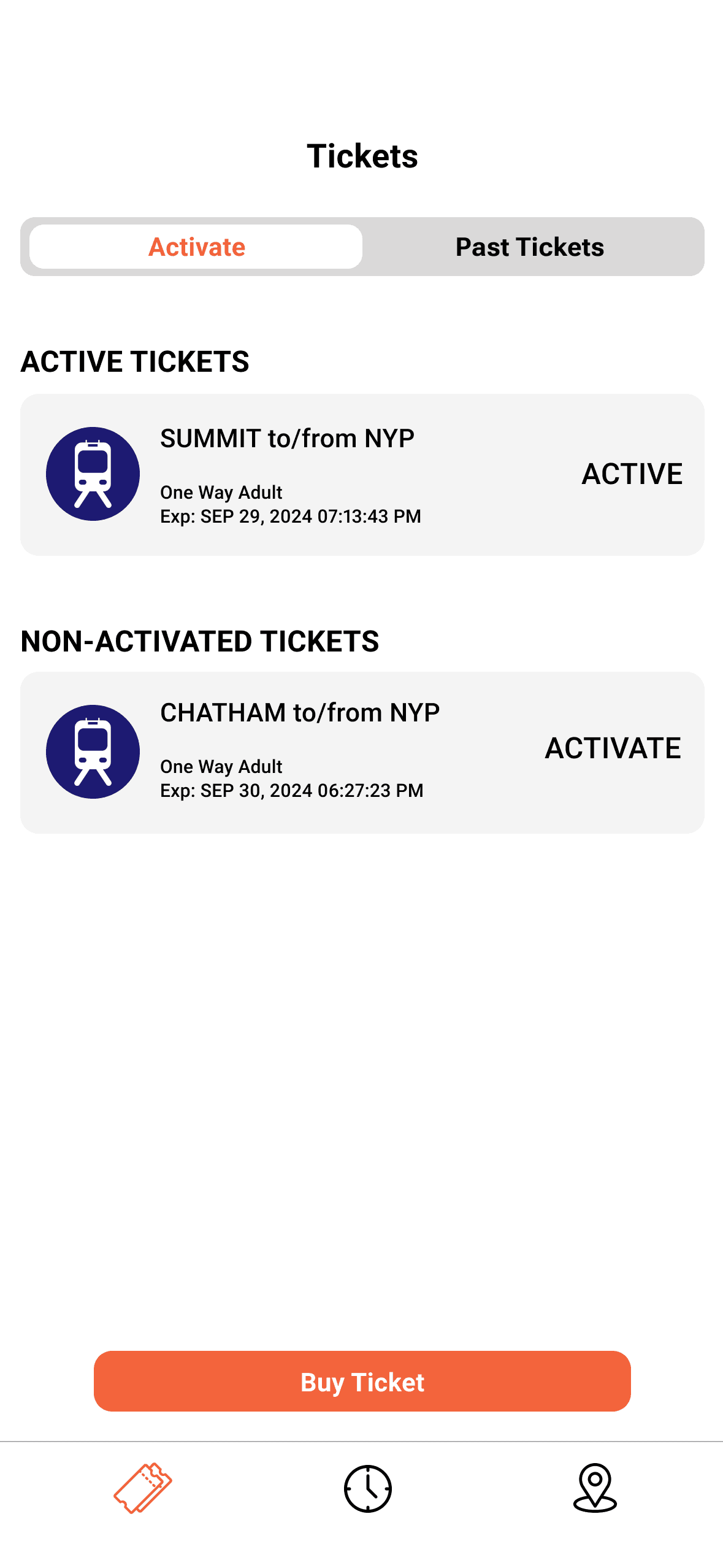
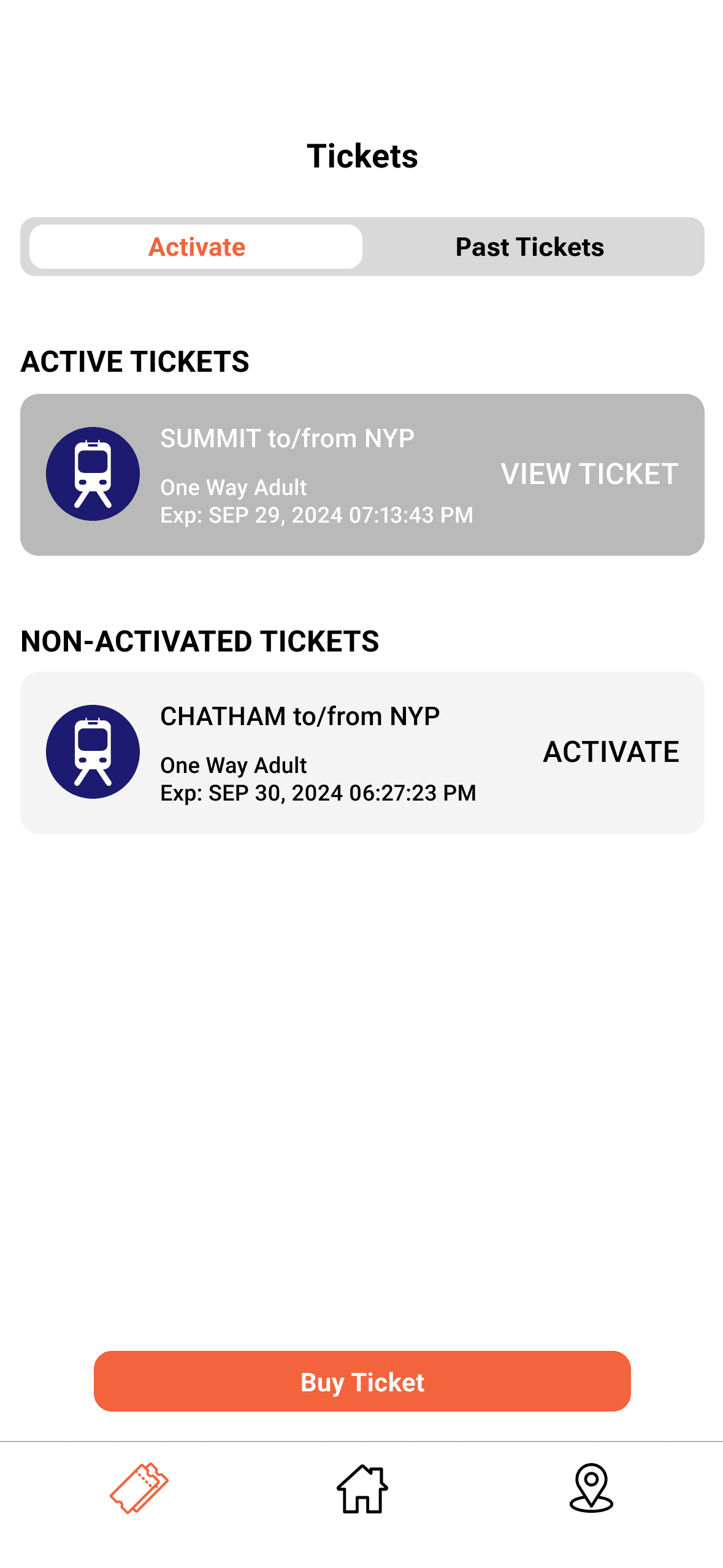
02 Active Tickets Page
Iteration 1 - Basic Layout
Basic ticket display layout with functional elements, but lacked visual clarity between ticket states.
Iteration 2 - Improved Ticket Status Visibility
Refined button labeling and color contrast to clearly distinguish between Active and Non-Activated tickets.
Highlighted active tickets in a deeper gray tone for easy recognition when presenting to conductors.
Adjusted font sizes to improve readability and reduce strain during on-the-go use.
Iteration 1
Iteration 2
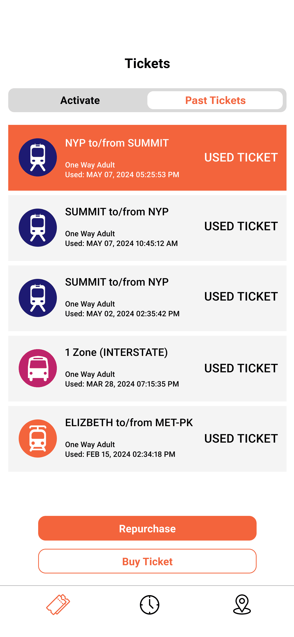
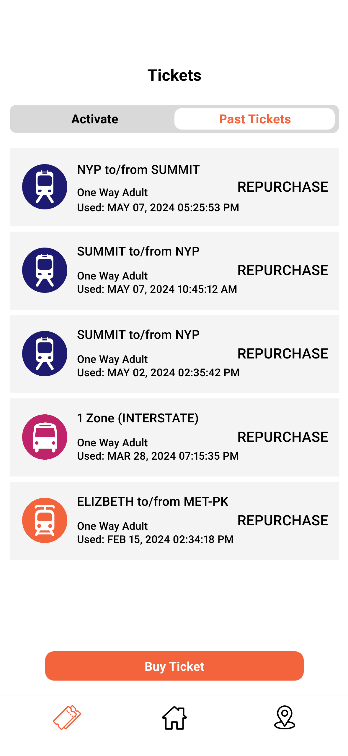
03 Past Tickets Page
Iteration 1 - Redundant Labeling
Displayed each expired ticket with a "Used Ticket" label, which added visual clutter without adding value.
Iteration 2 - Streamlined Repurchase Flow
Removed redundant labels and enabled direct repurchasing by tapping on any past ticket.
Preserved the familiar "Buy Ticket" button at the bottom as the primary action for new purchases.
Reduced steps in the flow, making rebooking faster and more intuitive.
Iteration 1
Iteration 2
The Final Prototype
💡 Try It Yourself
Scenario
You're commuting to a job interview in New York City.
It's Monday, September 23, 2024, and you're leaving your home in Summit, New Jersey around 1:00 PM. You plan to take NJ Transit to avoid traffic.
Task
Find and save the next train from Summit to NY Penn Station.
Hint: remember to save (bookmark) the trip in order to view it on the homepage.
Conclusion
This project was part of a class assignment focused on redesigning a portion of an existing application to improve usability. Given more time—or in a future iteration—I’d love to expand the prototype into a fully functional experience, incorporating additional features like a robust trip planning tool to better support users' end-to-end journeys.
What I learned…
01 Peer feedback saved my project
Usability testings are everything. They challenged my design decisions and pushed me to provide real justification for every choice, ultimately making the app stronger and more thoughtful.
02 Use existing interfaces to inspire new ways of designing
I learned the value of drawing inspiration from other apps, both within and outside the transit space. Comparative research sparked creative solutions and helped me rethink how familiar features could be adapted in more intuitive ways.
03 Design for clarity in high-pressure moments
Commuters often interact with transit apps under time pressure. I had to prioritize simplicity, speed, and clear visual hierarchy throughout the redesign.
Designed with 🪄⋆。 °✩ and 🍵 by Iris.